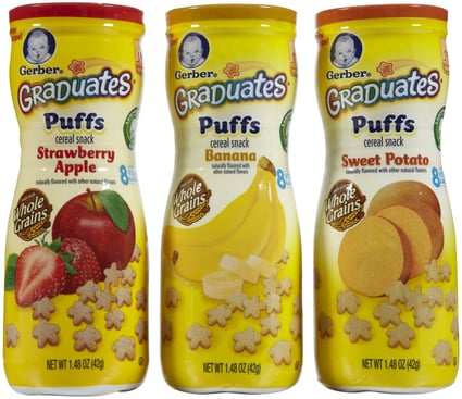
For decades, Gerber Products Company has established itself one of the top manufacturers of baby food. Now a subsidiary of Nestle, the company is instantly recognized for its branding – the adorable Gerber baby is easy to spot on retail shelves, and parents associate it with products they know and trust.
The brand recently stepped up its offerings and introduced the Gerber Graduates line of food products targeted to each stage of a child’s development. Its Puffs cereal snack has become a go-to option for parents in part because of its sturdy, portable packaging.
Unfortunately, the brand has been in the midst of a controversial lawsuit centered on its packaging design. A plaintiff group claims the big, colorful images of fruits and vegetables that appear on the outside of the container are misleading and do not accurately represent the products inside. Some parents feel misled by the snacks, which they say contain little more than empty calories and not the nutritious, natural ingredients boasted proudly on the outside of the packaging. Nestle has fired back, explaining it has been compliant with FDA regulations and its snacks do contain nutritious whole grains, vitamins and minerals.
Regardless of the truth behind the ingredients in Gerber’s products, there’s no doubt the brand has taken a hit from these concerns. If consumers feel they are being deceived or misled by a company they feel loyal to, there will be repercussions and negative consequences. Food and beverage manufacturers can avoid this type of misrepresentation by being as transparent as possible and packaging their product so it highlights exactly what’s inside.
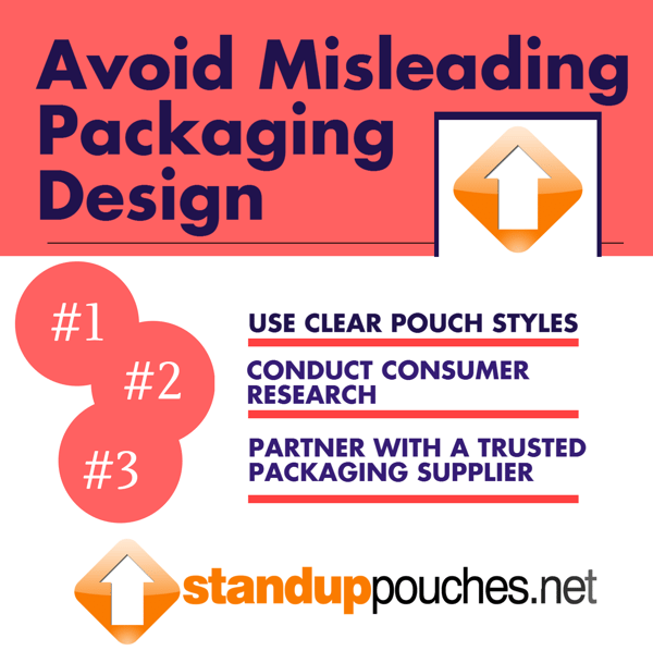
Follow the three steps below to ensure your product packaging is designed with the care and attention to detail it deserves:
1. Use Clear Pouch Styles
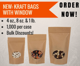
Brands can never be too transparent – showing shoppers exactly what they can expect when they open your product packaging is an easy way to gain their trust. Using all clear film stand up pouches gives consumers a full view of the treats inside the bag. For companies that want more space for branding and colorful designs on their product packaging, opting for a kraft stand up pouches with window is another great solution. The paper-like exterior gives off a more natural feel, and the transparent window shows off the product inside without losing too much space for great design.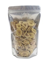
Gerber packages its Graduates Puffs in a solid, opaque container that is completely covered by text and graphics. There’s nothing wrong with using colors and images that pop, but if you really want to stand out on the shelves, kraft stand up pouches are the perfect way to set your product apart from the rest. Design isn’t just about your company’s logo or images on the packaging – it also includes the overall structure of the container and the materials used.
Stand up pouches guarantee your product will stay fresh and protected while looking great on retail shelves.
2. Conduct Consumer Research
Once you have selected the design of your packaging, It’s always a good idea to get as much feedback as possible before your goods enter the retail space. Ordering digital printed prototypes from your packaging supplier can help your company quickly get your goods in the hands of a test audience. There’s no better way to observe how customers feel about your product than having them actually interact with it. Observe their reactions to the graphics and images, as well as how they are handling opening and resealing the product packaging.
If your packaging is too difficult to open, or if consumers can’t quickly figure out what’s inside, you may need to reconsider your design and style of packaging. Teaming up with a packaging supplier who can work quickly and efficiently to help you retool your product packaging designs is key. Which brings us to our next point…
3. Partner With a Trusted Packaging Supplier
We can’t stress how important it is to keep your packaging and design needs in house. Time is of the essence, and if your company doesn’t get is branding or graphics right the first time, you need to be able to pump out new packaging quickly without delays, extra costs, or hesitations.
Finding a supplier who views you as a partner and cares as much about your company and customer as you do is absolutely essential.
Finding a supplier with its own design team can help give your company guidance as to which graphics work with specific pouch styles and what resonates best with customers. Great suppliers stay apprised of consumer behaviors and trends, and their warehouses use the most innovative new technologies to create fully functional, structurally sound packaging styles, like kraft stand up pouches with window. It’s always good to get as much input as possible designing your product, and working with a supplier that truly wants to showcase your offerings can take your product and its packaging to the next level.
Share this Image On Your Site
(Image Source: BakeryAndSnacks.com)
Related Posts:

