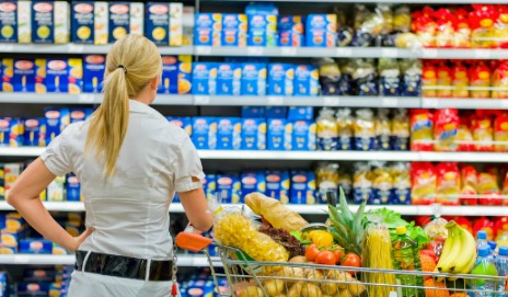
Successful brand builders know consumers buy with their eyes first — it takes only a few seconds for a shopper to make a purchasing decision based on the outside appearance of the product alone.
Catching a person’s eye as they scan the crowded store aisles requires businesses to place added emphasis on differentiating their goods and separating themselves from the competition. When it comes to building a successful marketing strategy for food products, packaging design and function need to be taken into consideration from the get go. After all, you spend so much time developing and perfecting your product, but how will consumers know yours is the best before they try it? This is what different packaging and pouch styles achieve, but only if brands are committed to keeping up with the latest innovations.
When consumers are asked to envision a specific brand, they most often picture the company’s logo — the symbol that appears on the product packaging. The color, shape, and overall structure of a product’s container is what people are actually seeing (quite frequently) in stores. They come in contact with a plethora of packaging styles, giving brands ample opportunity to catch their attention and make a lasting impression right from the get go. People generally don’t have the time, opportunity, or desire to try every single product on the market, but because shopping at the grocery store is an inevitable part of most people’s lives, those regular trips to the supermarket force them to come in contact with numerous products and types of packaging. This is why sleek, modern, unique packaging is such a crucial component of a marketing strategy for food products in the 21st century.
Traditionally, promoting a product depended on ad space in print publications or on broadcast radio or television. TV advertising most often shows a company's products being enjoyably consumed or used. Close ups of product packaging are highlighted in ads so shoppers can see it, remember it, and easily identify the product in retail locations. TV audiences, however, are becoming more fragmented in the digital age, making it difficult for traditional commercials and advertising tactics to work. Even if a consumer does watch an ad via TV or an online video streaming service, they’re only viewing it for 30 seconds — and it’s a one-way story. A food or beverage product’s package, however, can be held for anywhere from 10 minutes to an hour, and consumers continuously interact with it by opening, reclosing, pouring, or reading the package’s outside labels. The product’s packaging sits in their homes, and each time they open the pantry, refrigerator, or cupboard is another chance for a brand to communicate something new to the consumer.
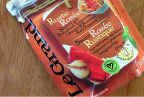
Visual cues grab a person’s attention well before any other type of communication. Labels and informative text are absolutely necessary, but a product has to draw the consumer in first so they’re actually tempted to pick up the item and begin interacting with it. High-quality imagery, symbols, icons, typography, and distinct, elegant new stand up pouch styles all work together to create strong visual cues that attract people to a product. Brands can’t be afraid to think outside the box if they want to connect with and form relationships with today’s shoppers. A packaging refresh shows customers a brand isn’t afraid of change, it has a hand in shaping trends, it’s committed to innovation, and it meets real people’s changing and evolving wants and desires.
PepsiCo is one brand making headlines for its emphasis on making packaging a key part of its marketing strategy for 2016. The soda company will roll out a new emoji campaign, allowing consumers to select a bottle with an emoticon that represents their mood at that moment — similar to Snickers’ successful personalized candy bar packaging. Innovations in digital printing and packaging prototypes make it easier than ever before to overhaul an item’s container while still staying true to its signature branding and maintaining the integrity of the product.
Likewise, new stand up pouch styles can mimic the size and shape of a jar, can, or box while offering significantly more retail space for visual cues that attract customers. PepsiCo ran into the dilemma of printing their emojis and new packaging designs on just one side of its cans and/or bottles — or spending more money for the branding to appear on the full wrap around the cylindrical container. Because consumers interact with a product in its packaging so often, and take it on the go with them, failing to feature the vital components that make your product recognizable on all sides of its packaging can result in a huge missed opportunity.
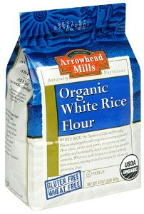
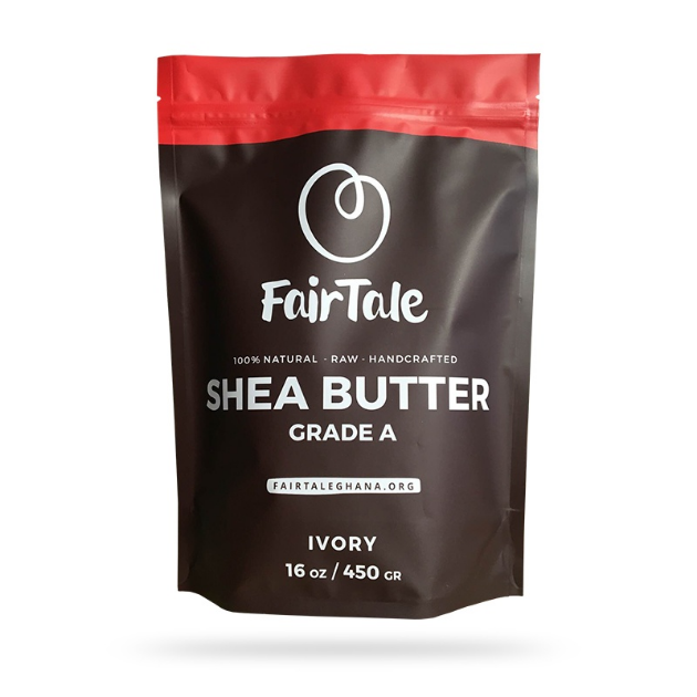
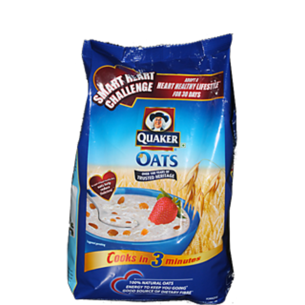
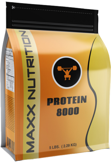
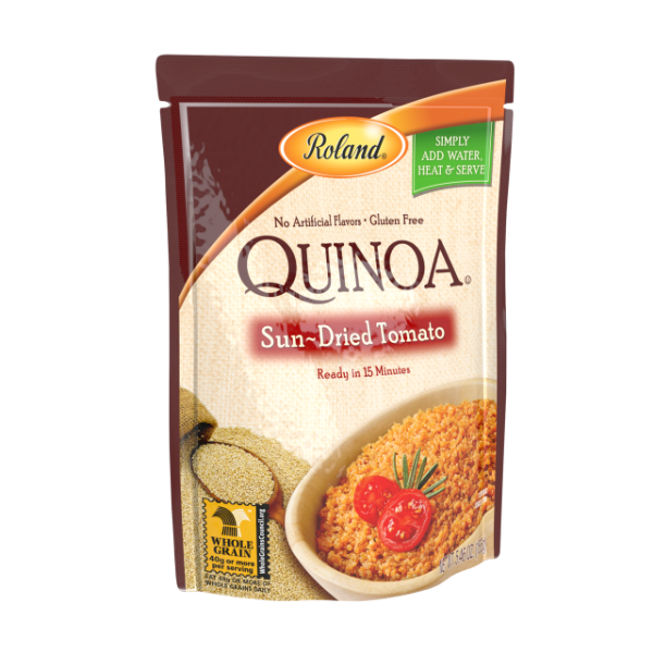
That’s the great thing about flexible packaging and the various stand up pouch styles available today: There is significantly more retail space on the flat sides and bottom of the container that can be custom printed to begin visually communicating with consumers no matter which side of the package they’re looking at.
Flexible packaging maintains the same functionality as jars, bottles, cans, and boxes with higher quality structural elements that are puncture resistant and protect products from coming in contact with outside contaminants. An eye-catching design is crucial for sparking attention and getting your product noticed, but if the packaging isn’t maintaining the shape and quality of your goods, consumers won’t return to it. Adding value to a customer’s purchase can be achieved by embracing innovative new pouch styles, introducing new visual elements that are sleek, inventive, and current, and ditching boring old containers and swapping them out with bold, intriguing, high-quality flexible retail packaging.
(Image Sources: Which?, Beach Packaging Design)
Related Posts:
5P’s of Marketing: Why Product Packaging is Now Part of the Mix
How to Market a Product Refresh with Retail Packaging
Influencing Consumer Behavior With Retail Packaging—A Review
Get Products Packaged FAST with Digital Printed Prototypes: New eBook

