Ranked No. 1 on the Fortune 500 list for the third straight year, Walmart has grown into a colossal brand with more than 5,000 locations spread all over the U.S.
As the company grows, so does its share of competitors. Low-cost mega stores are popping up left and right, grocery stores are adapting so similar price models, and smaller shops are expanding to offer similar goods. So, how does a company with so much at stake remain one step ahead of the competition and reinvent itself as a disruptor in the industry?
 Retooling its branding efforts is vital, and that’s exactly what the retail chain has in the works.
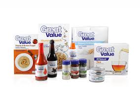
The company’s line of store-brand items, Great Value, comprises 85 percent of sales in the retailer’s in-store products. To give this line a makeover, the company plans to retool its Great Value retail packaging and launch a “version 2” that will feature more eye-catching designs and modern aesthetics.
The importance of keeping packaging fresh and visually appealing cannot be underestimated. Walmart, with so much to lose and so much to gain, shows us the value in flexible retail packaging and making efforts to ensure its designs are truly speaking to customers. (Image Source: Elmwood.com)
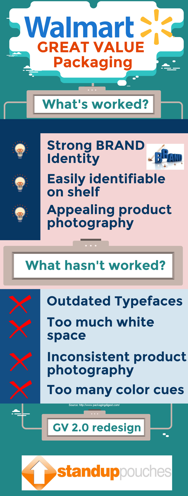
Packaging should be viewed as a key part of a brand refresh – after all, it’s what gives shoppers a first impression of your product. Walmart admits its Great Value brand wasn’t drawing in customers the way they wanted. Every Great Value product is tested for quality and is marked at a price 20 percent lower than national brands. With so much focus on this line, and care put into the high standards and low cost, Walmart needed to find a way to communicate the value of these products. Sharing this information with customers really begins with the packaging they see on the store shelves.
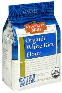
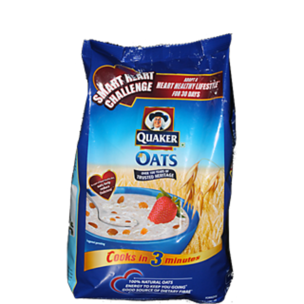
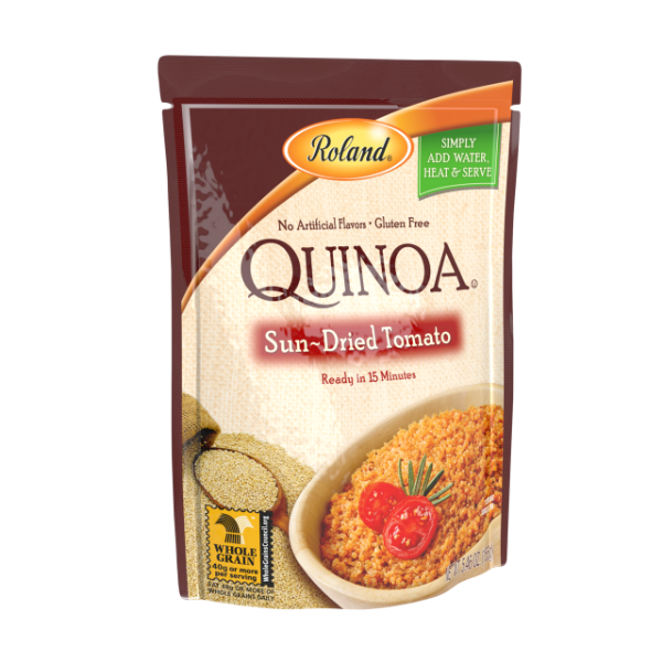
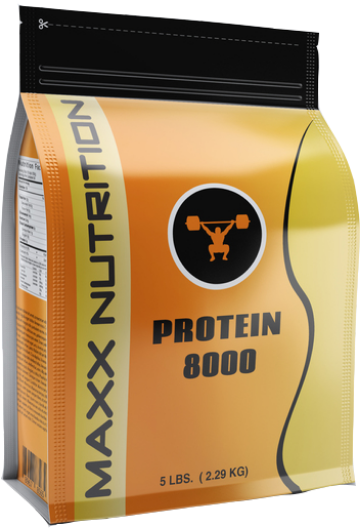
Great Value product packaging currently features a large amount of white space and outdated typefaces. As part of its brand overhaul, Walmart will add more appealing product photography, a wave-style design, color, callouts, and a modern typeface. Flexible retail packaging is directly linked with brand identity, and it lends well to vibrant hues and photos that really pop. Brand development is complicated, but designing and delivering goods in a package that really speaks to customers shouldn’t be.
The store recently launched Pure Balance Pet Foods in Canada two months ago with great success. This particular pet food packaging is a step in the right direction for the retailer, as each package relies on high-quality bags and printing that feature deep, rich colors and excellent photography that shows off the natural ingredients used in the products. Modern fonts and designs are used to help Walmart position the pet food as specialty-store quality at a fraction of the price.
Coupled with new packaging, Walmart is making strides toward reaffirming itself as an innovative brand with new forms of digital engagement. The store has been testing out grocery pickup facilities in the U.S. where customers can order a product online and get their product within hours at a drive-thru. This August, Walmart will also roll out GV Organics in ambient, frozen, and dairy sections. It’s all about convenience, and these modern concepts can easily be communicated with updated product packaging.
Overhauling a major brand – especially one that has been easily identifiable on the shelves for years – is no easy feat. Focusing efforts on the design of the flexible packaging is a smart choice for companies both large and small. Walmart is taking a line customers know and trust and are making a few significant tweaks without completely removing the branding elements that shoppers recognize.
Revamping the packaging is the perfect way to get customers’ attention and offer a sneak peek into new products that will soon hit the aisles. Whether your company is changing up its recipe or introducing a new item, communicating positive changes with flexible retail packaging should be a key part of your overall brand strategy.
