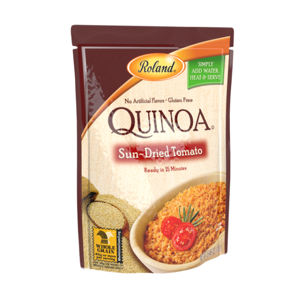
 There is no easy answer to this question. Technology does not put any limitations on how our snack packaging should look like. The packaging may resemble a drab folding container, or it may look like an intricately designed flower. Even though money can be a limiting factor to such wild imaginations of fancy, it still permits more designs in packaging than we can imagine. Usability is a third limiting factor. If customers are struggling to figure out how to take out snacks from your flower-like snack packaging, you better change it to something that is usable.
The point we are trying to emphasize here is that even though there are no technological limitations to what your packaging should look like, there are some common sense factors that come together in the creation of a usable, efficient, strong, and attractive packet. Here we have listed four such factors which determine what your snack packaging ought to look like:
(1) Usability
Snacks are a food item of everyday use. They should have flexible packaging that is not overly complicated. A simple packet is easy to open; your customers don’t want to wreck their brains to get to the food product inside. Good snack packaging should also be easy to carry and store. It should be resealable, and with accessories such as zip locks that allow people to reuse the bag multiple times.
(2) Safety
The most usable and customer friendly packaging may not benefit your business in the long term, and probably land you in prison, if it is not safe to package food products. StandUpPouches.net's customer printed stand up bags (blog.standuppouches.net/blog/stand-up-bags) and pouches have been tested by the FDA (Food and Drug Administration) for food product packaging and are declared safe.
(3) Attractiveness
Attractiveness of the packet is very important. Even if your product is delicious, a customer will not know it before they buy it. And to make them buy your product for the first time, you need to grab their attention. Make your packet attractive using bold and attractive colors that we offer here. We also have the rotogravure printing mechanism to make sure that your packages look their best.
(4) Strength
A dinosaur-like packaging may look attractive to children, but its design makes it vulnerable at some places. If the package is too complicated, it might be vulnerable at a few places. You don’t want the package to be torn while shipping. Plus, if it is vulnerable to tears, it can attract germs and the package would no longer be safe.
Based on the above points, it can be safely assumed that simple and easy packaging is the best one. Overly complicated packaging methods aren’t always good.

