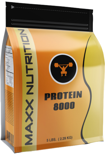
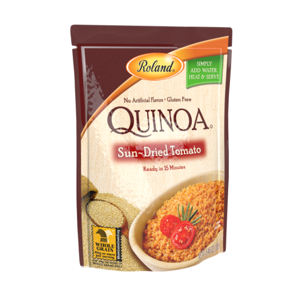
Traditionally, when companies go through a brand refresh, they spend time developing fresh, new designs for their product packaging. Focusing on consumer trends and preferences is key to developing a sleek, modern look for their new brand initiatives.
Nowadays, more companies – particularly those in the drink industry – are digging up ideas from their brand heritage for new beverage packaging designs.
Taking elements from the past is a smart way for companies to remind customers of the company’s legacy and how it continues to stay true to its values – even while retooling or developing a new product.
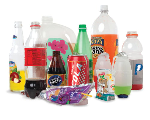 (Image Source: http://www.capitalotc.com/)
Gennesee Brewing, a leading American brewery since 1878, recently introduced a beverage packaging redesign that focuses on the company’s heritage. By returning to its original, simplistic graphic elements the brand is able to communicate its core values to loyal consumers without too much flash and flair. This seems to be a trend, particularly in the beer market, from small microbreweries to “big boy” brands that have become household names.
Miller Lite also went the retro route with its packaging, focusing on authenticity by returning to its original packaging design. The company introduced a temporary, promotional “Original Lite Can,” and consumer response was so positive that Miller Lite decided to keep the design and change more of its drink packaging to meet the demand. The company feels that its original look reminds customers what the beer company stands for even when it’s going in a new direction. It’s no secret that shoppers these days choose products from companies that are authentic and transparent. A return to a brand’s roots can be a smart move when revitalizing packaging.
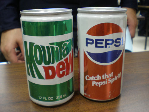 Image Source: http://www.seriouseats.com/)
There is a fine balance between sharp, simplistic designs and generic beverage packaging that fails to strike an emotional chord with consumers. Younger customers, especially, might not immediately recognize the nostalgia of the old-school-style packaging and may view the designs as basic, boring, or unappealing. The key for beverage companies is to focus on the structure of their packaging – if it lends well to bold colors using inks that won’t run or fade due to the elements, it’s much more likely to catch shoppers’ attention no matter how minimalist the graphics may be.
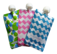
More of today’s leading beverage companies are choosing flexible retail packaging to showcase their branding and products in the very best light.
Spouted pouches for liquids are really taking off in this particular market because they stand up on shelves, and more of the product can fit in the aisles due to their light, flexible structure. Wine companies can even take advantage of flexible retail packaging in locations within retail stores that bottles can’t – namely, on hooks in the middle of aisles and near checkout lines – because beverage pouches can be produced with hang holes.
Incorporating traditional designs in your beverage packaging can be a great way for brands to go “out with the old and in with the old” to reach nostalgic consumers. While design is important in a company’s overall brand strategy, the materials of their packaging cannot be pushed aside as an afterthought. Choosing the right beverage packaging that lends well to graphics and colors can help producers go through a brand refresh and grab customers’ attention as they browse through the crowded store shelves.

